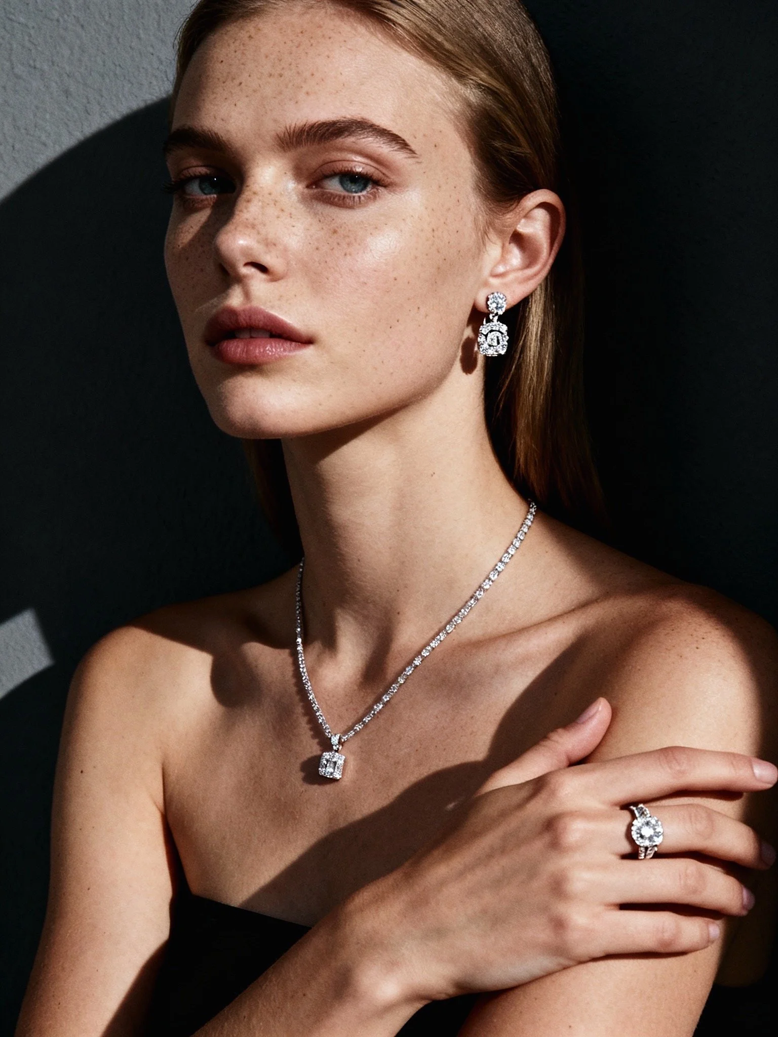
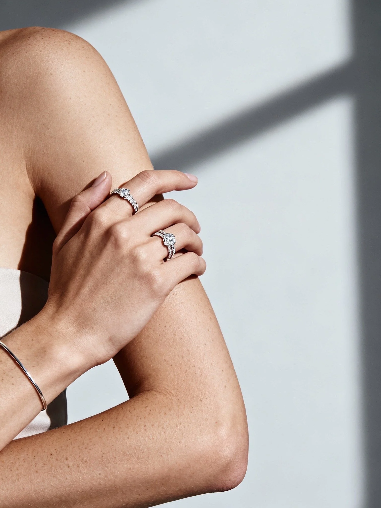
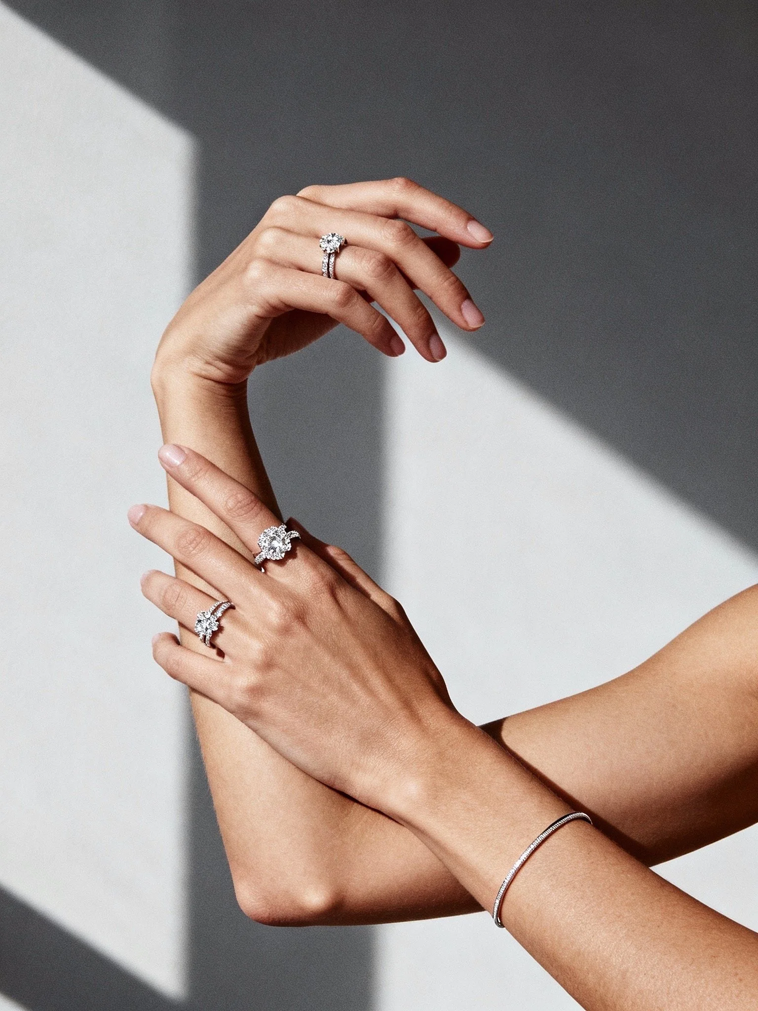
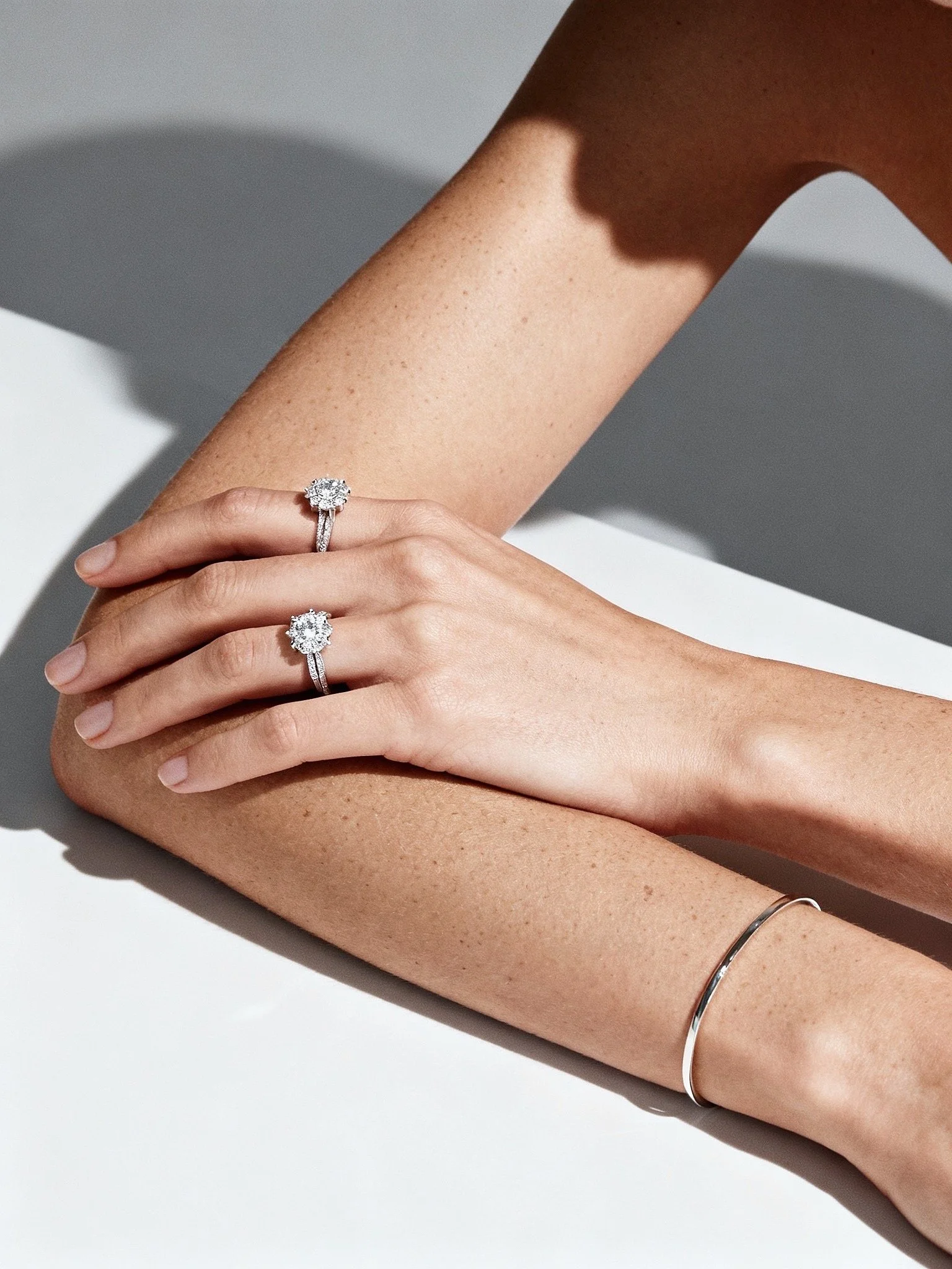
Where contrast learns control.
A fine jewelry campaign built around negative space and graphic form.
Shadowmilk shaped light like a layout tool, carving clean edges and quiet contrast.
The pieces read as structure before sparkle.
Luxury, reduced to lines.